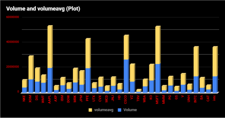
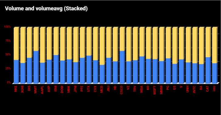
Volume Chart (Stacked)
Having spoken about the HE Chart-Prices enabling the comparison of apples and bananas, the Volume Chart (Stacked) takes things further enabling adding to the comparison some fish and steak. There is no restraint whatsoever on including amongst the stocks followed other investment instruments or indicators such as indices, as an example. In the case where an index is added to the list, the respective volume of that index added would simply dwarf the traded volumes of the stocks depicted on the same chart. This is where the Volume Chart (Plot) would fall short, but alternatively, this is where the Volume Chart (Stacked) would accommodate. The stacked method uses percentages and again streamline huge differences in volume numbers comparing stocks and indices.